TL;DR
We are given a PCAP file containing a USBPcap capture of some USB traffic on a laptop. The challenge description says the flag was typed in using the keyboard, but the user “forgot their keyboard”, but worked around the problem. Also, the USB device in the capture appears to be… a gaming mouse?
What happened was that the user typed in the flag on the Windows On-Screen Keyboard (OSK). We can use a combination of resources from online and some quick scripting of our own to regenerate their mouse movements, show where they clicked, overlay that over an image of the OSK, stretch/scale appropriately, and get the flag.
Analyzing the PCAP
As always with PCAP files, start by opening it in Wireshark. This won’t be terribly useful, but we can see what’s going on. It looks like it’s a USBPcap capture, not a network capture! It captures the USB data flowing in and out of the computer.
The bulk of the packets are “USB URB Interrupts”. The ones entering the host look to be carrying HID data.
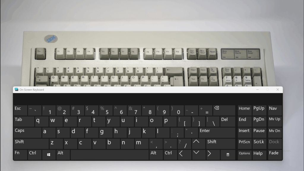
Looking at the top of the capture – near Device Descriptor – it appears that the device we’re talking to is a Logitech G203 Gaming Mouse. Weird, given that the description mentions typing in a flag… But it mentions that the user forgot their keyboard. How do you type using a mouse? You use the On-Screen Keyboard:
So, it seems we’ll need to reconstruct the user’s mouse movements and clicks. We could write a script to parse the USB HID traffic… or maybe someone’s already done that?
Don’t do the Heavy Lifting Yourself
Googling usbpcap mouse decoder or similar pretty quickly reveals this tool:
https://github.com/WangYihang/USB-Mouse-Pcap-Visualizer
It’s just one Python file, so it’s pretty easy to download and set up. It requires a few random packages, which we can install. When you run it with the PCAP file as an argument, it outputs a CSV like this:
timestamp,x,y,left_button_holding,right_button_holding
1750954114.927387,1,0,False,False
1750954114.928303,1,1,False,False
1750954114.932397,2,2,False,False
1750954114.934399,3,2,False,False
1750954114.935318,3,3,False,False
1750954114.936296,4,3,False,False
1750954114.937299,4,4,False,False
1750954114.938286,5,5,False,False
1750954114.9403,6,6,False,False
… and so on. We can Ctrl+F it to find that eventually, some of the left_button_holding values will be True. These are the coordinates where the mouse was clicked (generally, we find the rising or falling edges to indicate the start or end of the click – we’ll go with the falling edges, where it transitioned from True to False, from clicked to not-clicked).
Of note, this same tool offers a cool WebUI to visualize the results of the CSV file. I personally didn’t find this too useful, because we’ll want to overlay the mouse data on top of the OSK to see what was clicked, but it does exist as an option.
Also, a note: These are relative coordinates. The mouse just reports deltas back to the computer, how much it moved in the X or Y direction – it doesn’t report absolute screen coordinates. We’ll need to use our imagination to figure out how to map this onto the on-screen keyboard.
Click Analysis
At this point, this author moved into a Jupyter Notebook for further analysis. Matplotlib was my graphics tool of choice. The following sorts of relatively simple, if tedious, data processing tasks is where LLMs can shine, so don’t be afraid to vibe code your way through this one if need be (we sure did). LLMs also tend to be pretty decent at Python and Matplotlib.
import csv

with open(CSVPATH) as csvfile:
    reader = csv.reader(csvfile)
    header = next(reader)
    data = [
        [
            float(row[0]),
            int(row[1]),
            int(row[2]),
            row[3] == 'True',
            row[4] == 'True'
        ]
        for row in reader
    ]
    data.insert(0, header)

# extract just the clicks (falling edges)
clicks = []
prev = None
for row in data:
    if prev is not None and prev[3] is True and row[3] is False:
        clicks.append(prev)
    prev = row

# clean up the data
coords = [[row[1], row[2], row[3]] for row in clicks]
coords = coords[1:] # chop off the header
coords
This will return something like:
[[33, -145, True],
 [-401, -14, True],
 [-229, -5, True],
 [-529, -74, True], ...
These are all the places where the user clicked.
Matplotlib
Let’s try plotting all these clicks on a simple scatter plot.
import matplotlib.pyplot as plt

x_vals = [coord[0] for coord in coords]
y_vals = [coord[1] for coord in coords]

plt.figure(figsize=(14, 5))
plt.scatter(x_vals, y_vals, color='red', marker='o', s=100)

LABELS = True
if LABELS:
    plt.xlabel('X')
    plt.ylabel('Y')
    plt.title('Click Coordinates (X, Y)')
    plt.grid(True)
else:
    plt.gca().set_facecolor('none')
    plt.grid(False)
    plt.xlabel('')
    plt.ylabel('')
    plt.title('')
    plt.xticks([])
    plt.yticks([])
plt.savefig('huntandpeck_graph.png', transparent=True)
plt.show()
(Set LABELS to True or False to make the plot have annotations / ticks / etc, or to make it plain.)
You’ll get something like this:
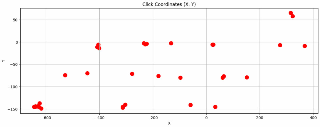
Compare this to the image of the OSK (or pull one up on your Windows machine, if available, and resize it a bit) and you might see it start to line up – the clicks occur in clear rows and (tilted) columns. There seem to be a lot concentrated in the corner – perhaps where the Shift key might be?
If you save it to huntandpeck_graph.png, you can overlay the two in an image editor, and perhaps resize and drag the layers around a bit until you see the clicks line up over the keys as expected.
Also, think about the structure of a flag – MetaCTF{yada_yada}. It’s going to have uppercase and lowercase characters, curly braces, and underscores. Maybe special characters and digits, but not necessarily. And it’s going to start with MetaCTF.
Movie Magic
Seeing all the clicks at once isn’t very useful. Can we visualize this in a better way?
import numpy as np
import matplotlib.pyplot as plt
from matplotlib.animation import FuncAnimation
from matplotlib.animation import FFMpegWriter

# ANIMATION SETTINGS
interval_ms=600
trail=4
fade_steps=10

# FIGURE INIT
fig, ax = plt.subplots(figsize=(10,4))

# BACKGROUND IMAGE
img = plt.imread("osk.png")
ax.imshow(img,
            #                   vvvv ADJUST THESE vvvvv
            extent=[min(x_vals) - 80, max(x_vals) + 470,  # left, right
                    min(y_vals) - 90, max(y_vals) + 130], # top, bottom
            aspect='auto',
            zorder=0)

# SCATTER PLOT
scatter = ax.scatter([], [], zorder=1, s=200)
ax.set_xlim(min(x_vals) - 30, max(x_vals) + 30)
ax.set_ylim(min(y_vals) - 30, max(y_vals) + 30)

total_frames = len(x_vals) * (fade_steps + 1)

def init():
    scatter.set_offsets(np.empty((0, 2)))
    return scatter,

def update(frame):
    print("\r", frame, "/", total_frames, end="", flush=True)
    idx = min(frame // (fade_steps + 1), len(x_vals) - 1)
    offsets = np.column_stack((x_vals[:idx + 1], y_vals[:idx + 1]))

    # fade
    age_fraction = (frame % (fade_steps + 1)) / (fade_steps + 1)
    ages = np.arange(idx, idx - len(offsets), -1) + age_fraction
    alphas = np.clip(1 - ages / trail, 0, 1)

    rgba = np.zeros((len(offsets), 4))
    rgba[:, :3] = 0.9, 0.2, 0.2 # dot color
    rgba[:, 3] = alphas

    scatter.set_offsets(offsets)
    scatter.set_facecolors(rgba)
    return scatter,

ani = FuncAnimation(fig, update,
                frames=total_frames,
                init_func=init,
                interval=interval_ms / (fade_steps + 1),
                blit=True,
                repeat=False)

print(" Done")
plt.show()
# ani.save("scatter.gif", writer="pillow")
writer = FFMpegWriter(fps=25, bitrate=1800)
ani.save("scatter.mp4", writer=writer, dpi=200)
The above code is a bit of a mess (LLM abuse will do that), but it will take every row of data from the x_vals and y_vals arrays and draw each one as a large red dot that slowly fades out of view. It draws these in order, so we can see each mouse-click as it happened.
We overlay this on top of an image of the OSK (I just downloaded one from Google Images). One needs to fiddle with the image extent values to get it to align properly with the mouse clicks. Remember, the flag always starts with MetaCTF{, and the capital letters and curly braces require the Shift key to be pressed.
When everything is aligned properly, we get the following video:
MetaCTF{clicking_the_keys}